Year
2022
Team
Product Manager x 1
Product Designers x 1
Engineers x 4
My Contribution
Information Architecture
User Experience
User Interface
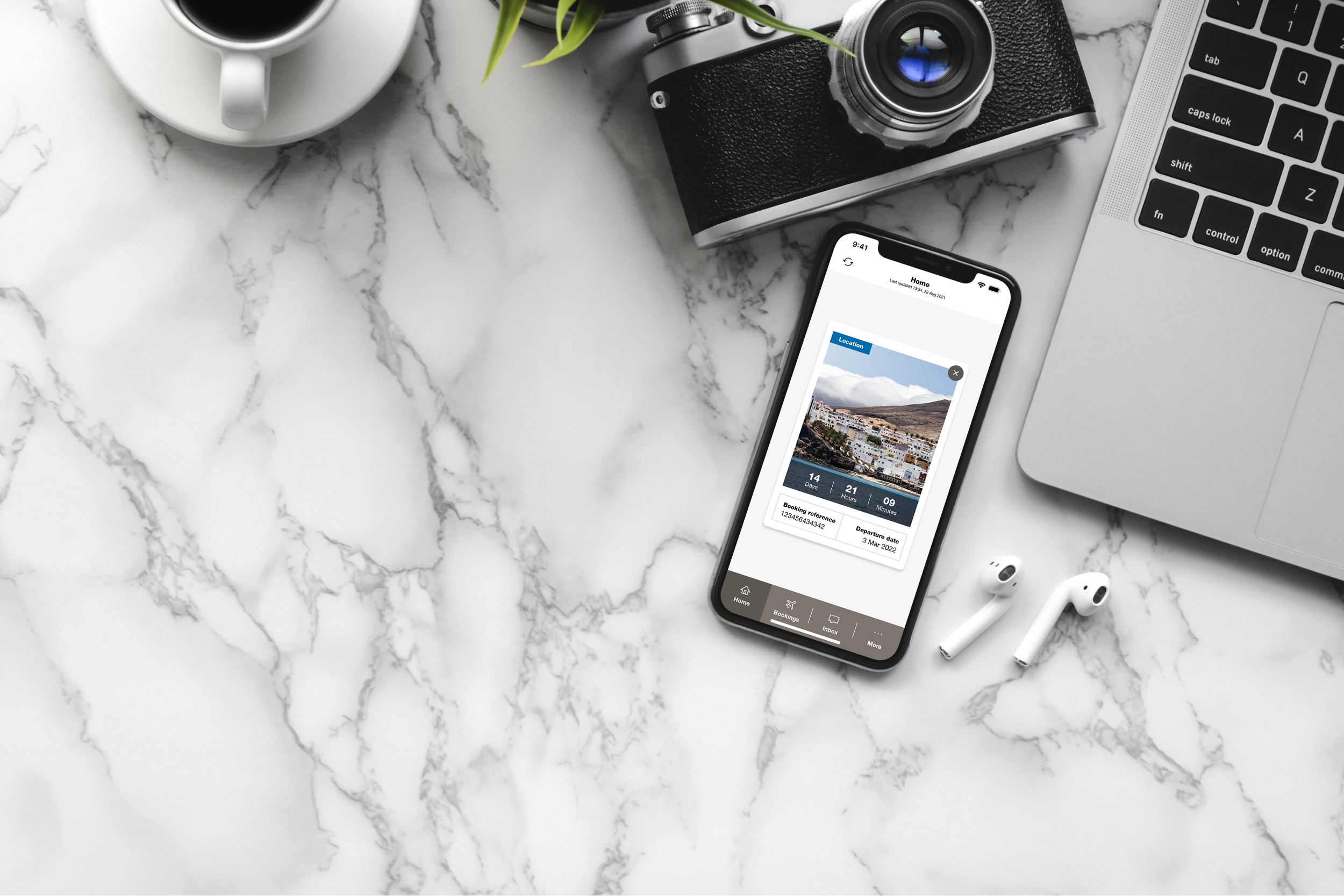
App Redesign / Rebrand
01 Project Brief
To rebrand and transform a legacy mobile app with only 6 screens into a modern, user-centric platform with over 30 screens in record time (4 weeks!).
02 Challenges
• The original app consisted of only six screens allowing users to only view static content, add their booking and receive notifications. Any interactive elements such as modifying your booking or even checking-in required users to leave the app and perform these actions on the website.
• Users found the app cumbersome and unintuitive, leading to frustration and high abandonment rates.
• Due to time constraints, we were only able to focus on two core functionalities: modifying your booking and online check-in.
03 Process Overview
1. User Journey Remapping
Remapped and redesigned the user journey to address the limitations of the original app.
2. Wireframing
Created wireframes to explore layout options, user flows, and design elements for a cohesive user experience.
3. Brand Integration
Worked closely with the branding team to ensure the redesign aligned with the new brand identity.
4. UI Enhancement
Introduced shadows to differentiate interactive elements, reduce visual clutter, and create a cleaner, more organized interface.
04 Process
Redefining The User Journey
Given the limitations of the original app, a comprehensive remapping and redesign of the user journey were essential. Then, I created wireframes and interactive prototypes to explore layout options, user flows, and design elements. My aim as always was to create a cohesive, intuitive, and engaging user experience.
Sitemap
Low & High Fidelity Wireframes
Original App Screens
App Interface Makeover
I collaborated closely with the branding team to ensure the app redesign reflected the new brand identity, including updated colors, typography, and visual elements. After reviewing many competitor apps and industry trends, I introduced shadows on some UI components to help users easily differentiate between interactive components and make the interface more intuitive. Shadows provided a subtle separation between UI elements, reducing visual clutter and making the layout appear cleaner and more organised.
Selected Components
Selected Screens
05 Results
I successfully transformed the legacy application into a modern, intuitive platform that not only aligned with the company's new brand identity but elevated it.
→ Completed the project in under 4 weeks.
→ The new app received positive feedback for its modern look, intuitive navigation and improved functionality. User engagement increased as a result of a more streamlined and enjoyable experience.


