Year
2022
Team
Product Manager x 1
Product Designers x 1
Engineers x 4
My Contribution
User Experience
User Interface
Data Visualisation
Iconography
Seat Map Redesign / Rebrand
01 Project Brief
To improve the user experience of the digital seat selection process by creating an intuitive, visually appealing, and functional seat map interface that simplifies seat selection and meets the diverse needs of passengers. I led the design process of this project from the initial kick-off to final delivery.
→ Streamline the seat selection process to minimise the time and effort required for users to choose their seats.
→ Update the seat map interface with a modern, clean design that aligns with the airline's brand identity.
→ Ensure the seat map is accessible to all users, including those with disabilities.
02 Challenges
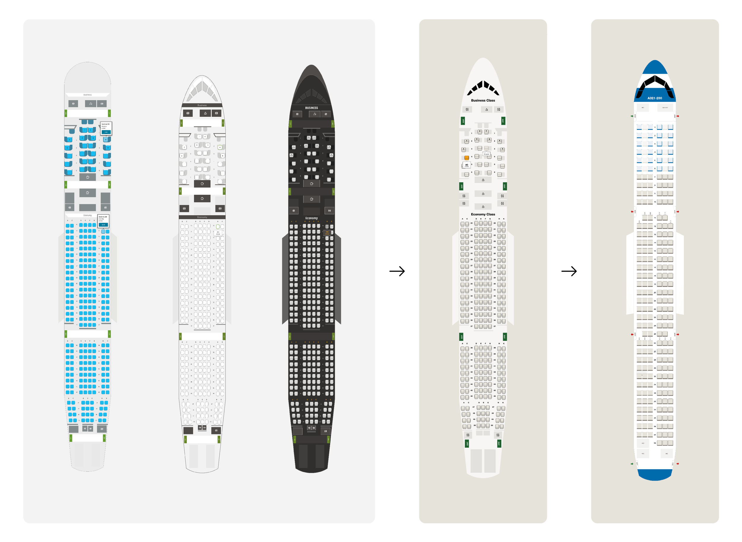
• Condor had three different seat map styles in use across various website sections (Search & Book, Online Check-In, and Manage My Booking), each with its own design language and functionality. This inconsistency led to user confusion, high abandonment rates during seat selection, and increased customer support inquiries.
• The seat map interfaces were not fully responsive and did not adjust to fit smaller screen sizes. On mobile devices, users often had to zoom in and out, scroll excessively, and struggle with navigation, leading to a poor user experience.
03 Process Overview
1. Research & Analysis
Gathered feedback to understand the limitations of existing seat map designs and examined seat maps from leading airlines and other sectors.
2. Unified Design Approach
Created a single cohesive design based on user needs and industry standards, addressing issues like complex and inconsistent seat icons.
3. Icon Simplification
Simplified seat icons with clean lines and straightforward shapes, improving functionality, scalability, and uniformity across devices.
4. Aircraft-Specific Adaptation
Designed seat maps to accurately reflect the unique configurations and layouts of Condor’s six aircraft types while maintaining a consistent design.
5. Modular System
Developed a modular system with reusable elements like seat icons and aisle layouts, ensuring consistency across different aircraft types.
6. SVG Integration
Used SVGs for scalable and precise seat maps, effectively handling curved and irregular aircraft shapes, such as noses and tails.
04 Process
One Cohesive Interface
I started off by gathering insights from users and stakeholders to understand the limitations of the existing seat map designs. I also examined the seat map designs of leading competitors in the airline industry, as well as other transportation sectors (train and bus services) and industries with complex seating arrangements (theaters and stadiums).
With a clear understanding of user needs and industry standards, I created a single, cohesive design that:
→ Balances the display of various seat features (extra legroom, proximity to restrooms, etc.) without overwhelming users.
→ Works seamlessly across all platforms, particularly mobile.
Seatmap Interface Evolution
Icon Simplification
The previous seat icons were detailed and complex, which made it difficult to quickly assess seat availability and type. Different versions were used across the website, leading to a lack of uniformity and increased cognitive load. What is more, they did not scale well on different devices.
I simplified the icons utilising clean lines and traigjtforward shapes, moving away from overly detailed designs. This modern minimalist aesthetic not only reflects current design trends but most importantly enhances functionality.
→ Improved visibility and distinguishability of different seat types.
→ Reduced visual clutter.
→ Made the icons easily recognisable and usable by all users.
Appeasing Aviation Geeks
Condor’s fleet includes six different types of aircraft, each with unique seating configurations, cabin layouts, and structural elements like noses and tails. The seat map redesign needed to accurately represent these variations in a way that was intuitive for users while maintaining a consistent and cohesive design across all aircraft types.
The seat maps were designed using a modular system, where common elements like seat icons, aisle layouts, and emergency exits could be reused and adapted across different aircraft. This modularity helped maintain consistency while accommodating the specific needs of each aircraft type.
To handle the varying aircraft shapes and layouts, we used SVGs, allowing for precise and scalable representations of each aircraft's seatmap. SVGs enabled smooth integration of curved and irregular shapes, crucial for depicting noses and tails.
→ 6 versions of a seat map designed referencing the official aircraft interior layout documents for desktop and mobile.
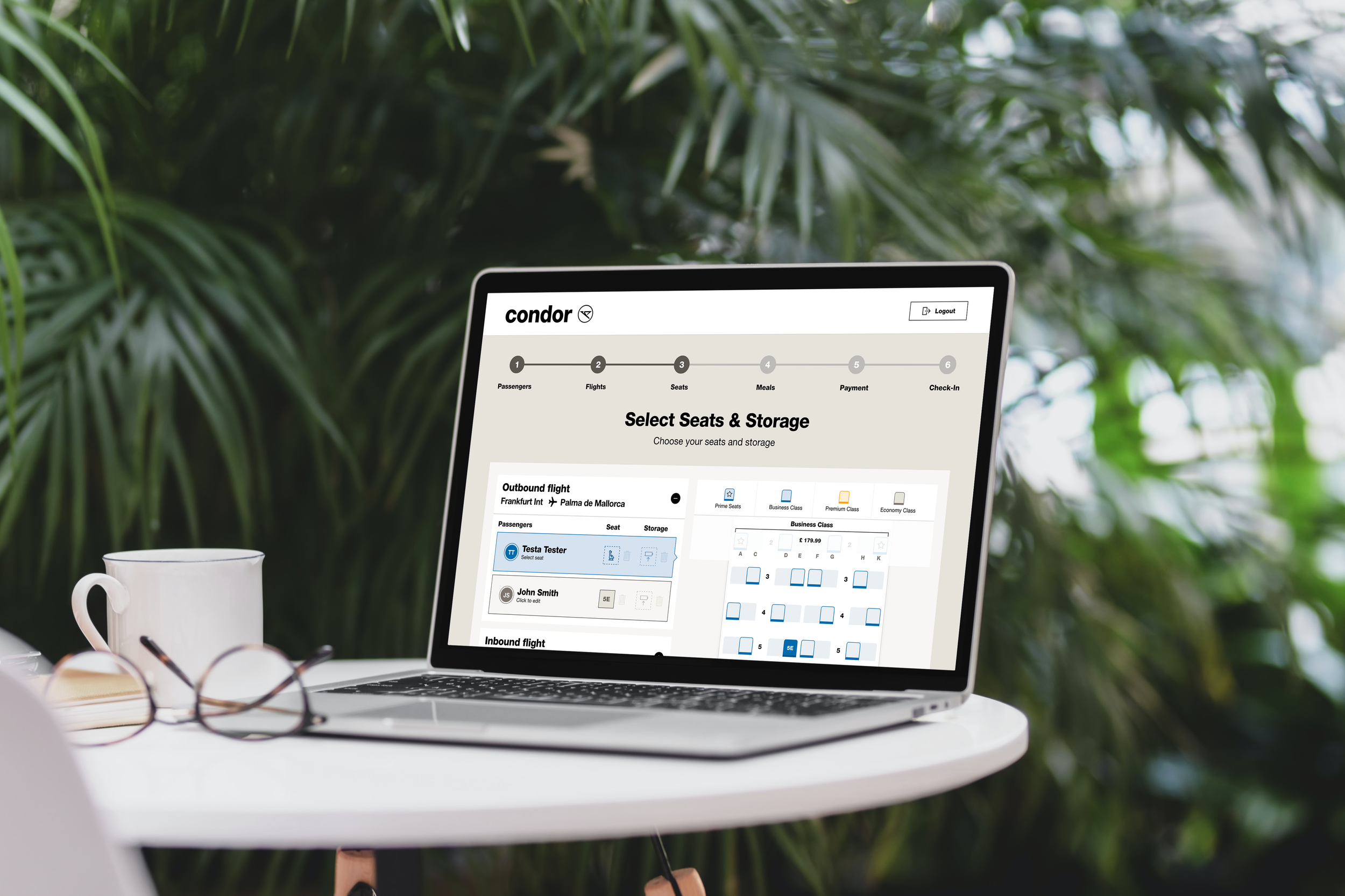
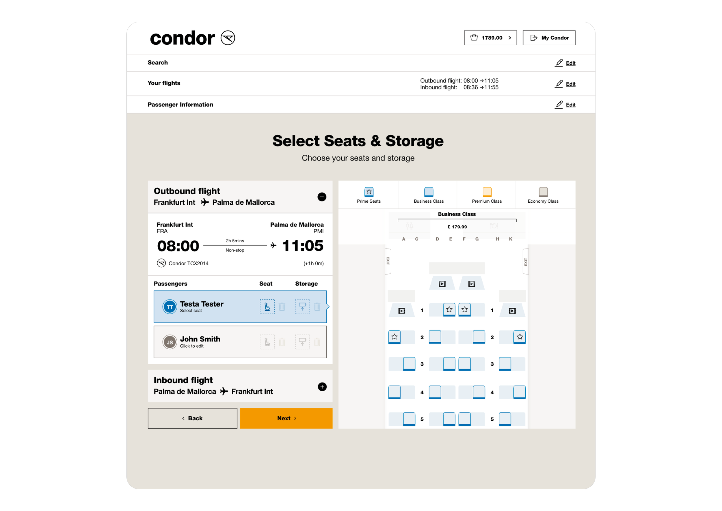
Seatmap in SITU - Search & Book
Seatmap in SITU - Online Check-In
05 Results
The final seat map design successfully integrated the unique characteristics of all six aircraft types into a cohesive and user-friendly interface. Users could easily identify and select seats regardless of the aircraft type, with clear visual indicators for structural elements like noses and tails that helped them better understand the layout of the cabin.
→ Users reported a smoother, faster seat selection process, with a notable increase in positive feedback.
→ The redesign achieved WCAG 2.1 compliance, making it accessible to users with various disabilities.
→ The improved design led to a reduction in seat selection abandonment, contributing to higher conversion rates during booking.
→ The modular and responsive design approach ensured that the seatmaps worked seamlessly across all devices, including mobile, further improving user engagement and satisfaction.


