Year
2023
Team
Product Manager x 1
UI Designer x 1
Engineers x 2
My Contribution
User Experience
User Interface
Data Visualisation
Route Maps Redesign / Rebrand
01 Project Brief
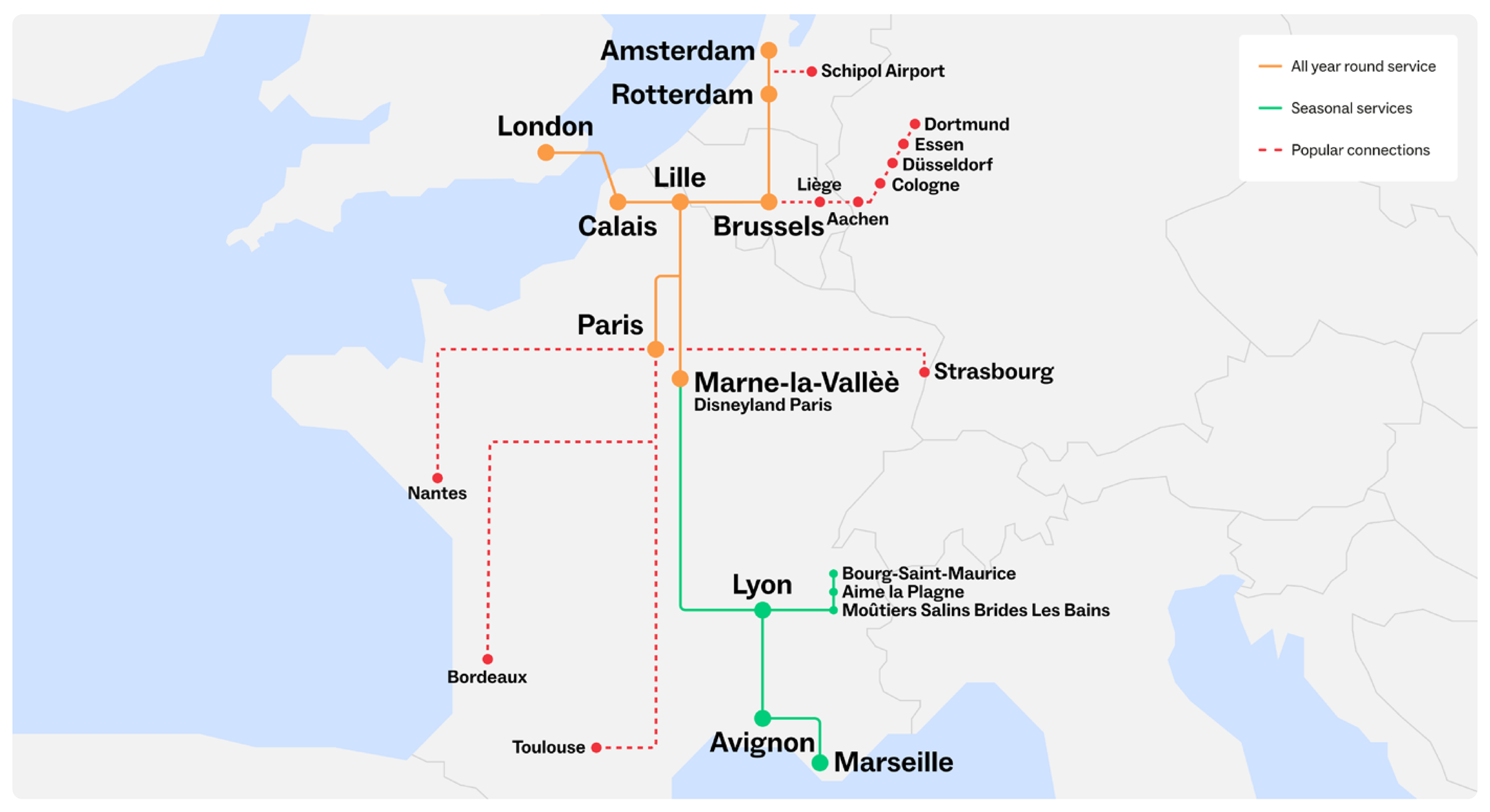
I independently managed the redesign of Eurostar’s route maps, with periodic oversight from the Head of User Experience. The project’s objective was to enhance both the visual appeal and functionality of the route maps.
→ Incorporate Eurostar’s new brand identity into the route maps.
→ Ensure that the route maps communicate travel information in a clear and accessible manner.
→ Optimise the maps for various devices and screen sizes.
02 Challenges
• Striking a balance between displaying geographically accurate travel data and maintaining a clean, uncluttered visual design.
• Making the maps accessible to all users, including those with visual impairments.
03 Process Overview
1. Research & Inspiration
Analysed route maps from competitors and industry leaders, drawing inspiration from the London Underground map to identify best practices and establish key design principles.
2. Colour Exploration
Explored various colorways, incorporating primary, secondary, and accent colors to align with Eurostar’s new brand identity and enhance usability.
3. Version Development
Designed 40 route map versions tailored to five markets, four languages, and both desktop and mobile platforms.
4. Final Refinement
Ensured each version was visually cohesive, user-friendly, and accessible across different devices and languages, meeting the needs of diverse markets.
04 Process
Referencing A Design Classic
I began by analysing route maps from competitors and industry leaders to identify best practices and innovative features. I then drew inspiration from the iconic London Underground map, renowned for its clear and effective depiction of complex transit networks. The key guiding design principles were clear colour coding, simplified geography, and abstract representation of transit lines.
London Underground Map
Development Stages
Colourways
I explored various colourways to ensure that the final design not only aligned with Eurostar’s new brand identity but also enhanced the map's usability and readability. I included primary colours, secondary colors, and accent colors to cover different aspects of the map.
Multi-Market, Multi-Language, Multi-Device
I designed 40 route map versions in total (5 markets, 4 languages, desktop, mobile). Every version was visually aligned with Eurostar’s new brand and accessible across different devices, markets and languages.
Final Route Map in SITU
Before & After
05 Results
The new route maps were both user-friendly and consistent with Eurostar’s rebranding objectives. The final design successfully balanced aesthetic appeal with clarity and usability.
→ The new route maps significantly enhanced user understanding of transit connections.
→ The new maps aligned with Eurostar’s overall rebranding strategy which led to increased user engagement and higher satisfaction rates.


